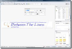
I figured for creating a new blog banner to eat our own Autodesk dog food and use Autodesk Impression. Dogfooding is the practice of using your own technology. It was easier than using Photoshop and ended up with the authentic look complete complete with a coffee cup stain on the blueprint. I have not manually drafted or used a stinking anhydrous ammonia spewing blueline machine in over 15 –20 years but it was a nostalgic play on the blogs name Between the Lines. Autodesk Impression 2 is available to Autodesk Subscription customers now.
What do you think? Leave a comment.
Cheers, Shaan
5 comments
I like the engeneering touch but I think a little background to highlight the title from the rest would enhance the whole page.
Loading...
Julián,
Thank you for the feedback. I was thinking of a light blue to yellowish background to simulate blueprint paper but it did not make the text stand out.
Thank you for reading Between the Lines!
Best Regards,
Shaan
Loading...
Look good for a short while but it strains my eyes to keep looking at it because of the blurry effect.
Loading...
Thanks for the comments Jimmy. Staring at blueprints had the same effect. 🙂
I will eveolve the banner over time based on feedback.
Cheers,
Shaan
Loading...
How about this version with the sepia like background and realistic yellowed edge? The only thing missing is the smell of ammonia.
 Look Up!
 I figured for creating a new blog banner to eat our own Autodesk dog food and use Autodesk Impression. Dogfooding is the practice of using your own technology. It was easier than using Photoshop and ended up with the authentic look complete complete with a coffee cup stain on the blueprint. I have not manually drafted or used a stinking anhydrous ammonia spewing blueline machine in over 15 –20 years but it was a nostalgic play on the blogs name Between the Lines. Autodesk Impression 2 is available to Autodesk Subscription customers now.
I like the engeneering touch but I think a little background to highlight the title from the rest would enhance the whole page.
Julián,
Thank you for the feedback. I was thinking of a light blue to yellowish background to simulate blueprint paper but it did not make the text stand out.
Thank you for reading Between the Lines!
Best Regards,
Shaan
Look good for a short while but it strains my eyes to keep looking at it because of the blurry effect.
Thanks for the comments Jimmy. Staring at blueprints had the same effect. 🙂
I will eveolve the banner over time based on feedback.
Cheers,
Shaan
How about this version with the sepia like background and realistic yellowed edge? The only thing missing is the smell of ammonia.